




Key Decision
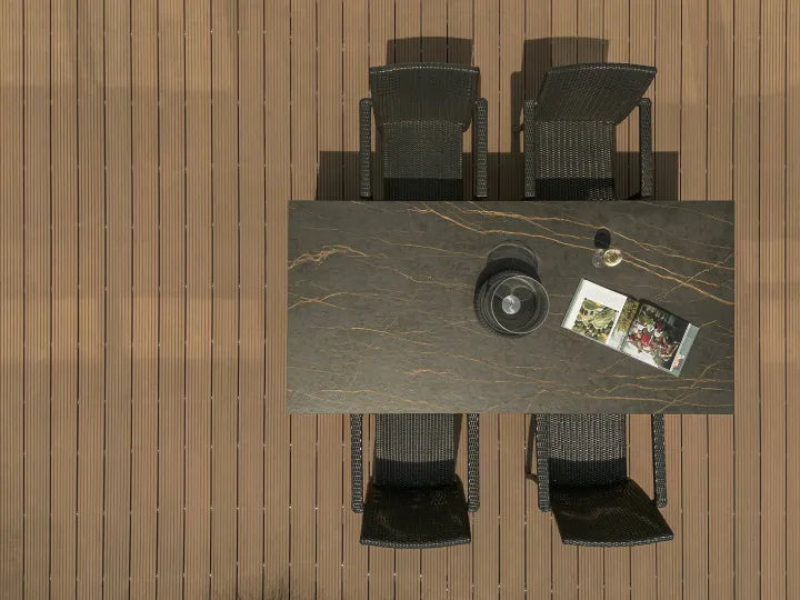
Choose solid-color sintered stone when the surface should quiet the room and let cabinetry, furniture, tile or artwork lead. Choose veined sintered stone when the slab itself should create movement and become the focal plane.
The choice changes with pattern contrast, visible surface area, viewing distance, surrounding finishes and the number of seams or returns. “Solid is modern” and “veined is luxurious” are useful starting impressions, not reliable selection rules.
Solid Color vs Veined Sintered Stone at a Glance
Both terms describe visual direction, not a complete technical specification. A solid-color slab reads mainly through hue, undertone, finish and geometry. A veined slab adds directional lines, branches or clouds that can be subtle or highly active. The pattern by itself does not prove strength, stain resistance, thickness, edge appearance or application suitability; those checks belong to the exact product data.
| Decision | Solid color | Veined |
|---|---|---|
| Visual role | Quiet field that emphasizes shape, proportion and adjacent materials | Active surface that introduces movement, contrast and a focal point |
| Best starting condition | The room already contains a strong grain, tile pattern, color block or artwork | The surrounding palette is restrained and the slab should carry the main pattern |
| Scale risk | A large field can feel flat when tone, texture and lighting are not considered | A pattern that looks controlled in a crop can become dominant across an island or wall |
| Layout focus | Joint position, color continuity, edge treatment and plane geometry | All solid-color checks plus vein direction, focal zones, returns, repeats and face sequence |
| Approval evidence | Physical surface sample plus batch and edge evidence as required | Physical surface sample plus full-slab media and a marked orientation/layout review |
Choose Solid Color When the Room Already Has a Strong Voice
A solid surface is most useful when another element deserves attention. Strong wood grain, patterned cabinet fronts, textured wall tile, colored joinery or a distinctive floor can already supply enough movement. A quiet countertop or wall plane gives those elements room to read instead of adding a second competing motif.
That does not mean the surface becomes invisible. With no prominent veins, proportion becomes more obvious: the thickness of a worktop, the length of an island, the rhythm of wall joints and the contrast between horizontal and vertical planes all become part of the design. Deep green, warm beige, muted grey or black can be visually strong even when the pattern is restrained.
Compare muted-colour sintered stone options when the design needs restrained colour rather than prominent veining.
For repeated commercial modules, solid color can also simplify the visual brief because the design is not asking every counter, vanity or tabletop to carry the same vein event. It still needs batch, finish and sample approval; “solid” is not a promise that separate production runs will be visually identical. Browse the current Solid Color Sintered Stone collection only after the desired undertone and finish direction are clear.

Choose Veined Stone When the Surface Should Carry Movement
Veining earns its place when the slab is intended to be seen as a feature, not merely a durable background. A long island, reception face, full-height backsplash or wall panel can use directional movement to pull the eye across the composition. Fine, low-contrast veins create texture at close range; broad, high-contrast veins remain legible from farther away and make a stronger statement.
The changing winner is the surrounding room. Veined stone can animate flat-front cabinetry and a restrained palette. The same slab may feel crowded beside expressive timber, patterned tile and a high-contrast floor. A practical starting rule is to give one hard-finish surface the dominant pattern, then let the others support its background tone or vein color.
Do not approve a veined surface from the most attractive crop; approve how the complete face reads across the actual island, wall, return and normal viewing distance.
The current Marble Look Sintered Stone collection provides multiple movement directions. Use it to form a visual shortlist, not to assume that every face has the same vein route, finish, edge relationship or bookmatch option.

Room Size Matters Less Than Visible Surface Area
A small kitchen does not automatically require solid color, and a large room does not automatically need bold veining. What matters is how much slab is visible at once and how far away it is normally viewed.
Close-range reading
On a compact vanity or short counter, subtle veining may register as texture rather than a large gesture. A solid color may feel calm, but it can also look severe if the undertone and finish are disconnected from the room.
Long-range reading
Across an open-plan island or tall wall, broad veins remain visible from the adjoining space. Fine veins can merge into a tonal field, while high contrast can dominate the entire elevation.
Review the surface from the positions where users will actually see it: seated at the island, entering the room, standing in the adjacent lobby or viewing a feature wall across a corridor. This test is more informative than attaching “small-space” or “large-space” labels to the two categories.

Coordinate Cabinets, Backsplash, Floor and Lighting
Begin with visual hierarchy: decide which fixed finish leads, then make the other surfaces answer it. If the countertop has expressive movement, a low-contrast backsplash usually gives it a cleaner field. If the countertop is solid, the backsplash, cabinet grain or furniture can take more pattern without forcing two equally active surfaces to compete.
Next, compare undertones rather than color names. Two materials called “white” may separate into warm cream and cool blue-grey under the installed lighting. A grey vein can relate to metal and cool cabinetry; a warm brown or gold movement may connect more naturally with oak, walnut, bronze or beige finishes. The broader sintered stone color guide owns that undertone and lighting decision.
Finish changes the reading too. A more reflective surface can sharpen contrast and pick up window or fixture reflections, while a quieter finish may soften the same pattern. Approve the exact product and finish together rather than treating a colorway name as the complete visual specification.

Plan Seams, Waterfalls and Wall Returns Before Approval
Solid color removes the risk of a vein changing direction at a joint, but it does not make the physical joint disappear. A uniform field can still reveal a seam through shadow, color difference, adhesive line or workmanship. Joint location, edge detail and lighting remain part of the visual plan.
Veined layouts add another layer: the team must decide which part of the face belongs at the focal zone, where the movement crosses a seam and whether a waterfall or wall return should continue, turn, mirror or deliberately stop. A visually persuasive crop can become an awkward installation if the sink, hob, opening or joint removes the pattern’s main gesture.
For projects that need A/B faces or mirrored elevations, use Funtek’s Marble Look Face & Bookmatch Guide for the detailed approval record. This comparison does not promise a specific face count or continuity option for every product.

Approve the Choice in Three Steps
- Set the visual role. Write one sentence: “The surface should be a quiet field” or “The surface should be the focal movement.” If the team cannot agree on this, product browsing will only create more options.
- Compare evidence at the right scale. Use a physical sample for undertone, finish and texture. Use full-slab photos or video for pattern scale, vein position and repeat. Add marked elevations or cut layouts when seams, returns or openings affect the composition.
- Release the exact selection. Record product, finish, thickness, sample reference, face/orientation requirements and the batch or slab evidence the supplier will provide. Keep technical suitability as a separate product-level approval.
The sintered stone sample approval guide explains which evidence a small sample can and cannot carry. For broader visual families beyond this pairwise choice, continue to the sintered stone pattern guide.
The Bottom Line
Solid color is the stronger choice when the project needs visual calm, clear geometry or freedom for another material to lead. Veined stone is stronger when the surface should supply movement, depth and a defined focal plane. The best answer changes when the visible area, viewing distance, surrounding patterns, lighting and layout change.
Make the first decision about visual role, not trend labels. Then compare a physical surface sample with full-slab evidence and an orientation plan before the product is released.
Compare Both Directions Before You Approve
Send the application, visible dimensions, cabinet or wall palette, preferred finish and whether the slab should read as a background or a focal point. Funtek can prepare a more focused solid-color and veined sample discussion.