


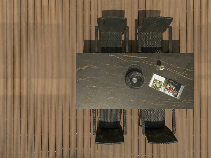


Quick Answer: What Countertops Look Best With Oak Cabinets?
The best overall starting point for oak cabinets is a warm white countertop with restrained movement. It brightens the kitchen, separates cleanly from most oak finishes and leaves the wood grain in control. White oak also works with greige or charcoal; honey and golden oak respond well to soft white, restrained gray veining or a deliberate dark contrast; dark oak usually benefits from a light warm counter.
Make the choice in this order: identify the finished oak tone, choose light, tonal or dark contrast, then decide how much countertop movement the room can carry. Material and product come after that visual direction. This prevents a beautiful slab from becoming the wrong answer for the actual cabinet door.
What Countertops Go With Oak Cabinets?
Oak works best with a countertop that does one of two jobs clearly: create a clean value contrast or repeat one cabinet undertone without copying every warm note in the wood. Because oak already has visible grain, low-to-medium movement is the safest default. Stronger veining can still work when the cabinet fronts are visually quiet and the backsplash and floor are restrained.
Start with the finished door rather than the species label. White oak can read beige, straw or taupe; honey oak can shift from golden to orange; red oak may show pink or rust; stain can move any of them much darker. The table below gives a first sample direction, while the following sections explain when each option works.
| Finished oak tone | Best first samples | Use carefully | Likely design effect |
|---|---|---|---|
| White oak | Warm white, greige, charcoal, black | Blue-white or nearly identical pale beige | Bright modern, organic modern or graphic minimal |
| Natural oak | Soft white, limestone beige, balanced greige | Mid-tone combinations with no light-dark separation | Scandinavian, transitional or quiet tonal |
| Honey oak | Soft white, restrained gray vein, charcoal | Yellow beige, orange stone or strong gold-on-gold | Clean renovation, transitional or modern refresh |
| Golden oak | Warm white, muted greige, deep neutral, soft gold vein | Overly busy brown-and-gold movement | Warm contemporary or grounded contrast |
| Red oak | Balanced white, muted greige, charcoal | Pink gray, orange or red-brown surfaces | Calmer, less red-forward palette |
| Dark-stained oak | Ivory, warm white, pale beige, quiet light gray | Large areas of equally dark counter and backsplash | Brighter luxury or controlled tonal depth |
Best Countertop Colors for Oak Cabinets
White Countertops
Warm white is the broadest-fit choice for oak cabinets. It creates a clear horizontal plane without introducing another strong color, so the cabinet grain remains visible. Choose fine gray, taupe or soft gold movement when plain white feels too flat. With pale white oak, a warm-neutral white keeps the room soft; with honey oak, it interrupts the yellow-orange field and makes the update feel intentional; with dark oak, it restores brightness.
The risk is not white itself but the wrong white. A blue-white sample can make a warm cabinet look more yellow, while a cream that is too close to honey oak can turn the entire palette amber. Compare at least two white families directly against the finished door.
Beige and Cream Countertops
Beige and cream create a quieter, more organic kitchen than white. They work especially well with natural oak, pale white oak and warm contemporary schemes where the countertop should support rather than lead. Limestone-look surfaces are useful when the room already includes warm plaster, travertine-look flooring, linen or brushed brass.
Use tonal beige with enough difference in value or undertone to keep the counter visible. Honey oak beside a yellow beige can look accidental rather than layered. A paler stone beige or a greige with less yellow usually creates a cleaner bridge.
Greige and Gray Countertops
Greige is the middle route between warm beige and cool gray. It can calm natural, golden or red-forward oak without creating the hard break of black. For white oak, a balanced greige produces a restrained organic-modern palette; for honey oak, a fine gray vein on a light field is often more effective than a solid cool-gray slab.
Judge gray beside the cabinet, floor and wall paint. A sample that looks neutral alone may turn blue or violet next to a golden finish. Mid-gray also needs enough daylight or lighter vertical surfaces to avoid flattening the room.
Black and Charcoal Countertops
Black and charcoal make oak look deliberate rather than dated. The dark horizontal line sharpens pale white oak and can pull honey oak into a cleaner, more contemporary palette. Charcoal is the easier version because it keeps the grounding effect without the absolute contrast of pure black.
Use the total surface area as the test. A black perimeter, a large black island and a full-height black backsplash create very different visual weights. Small or dim kitchens can still use dark counters when walls, backsplash and lighting keep enough brightness around them.
Green and Statement Countertops
Muted green is a natural partner for oak because it introduces color without abandoning an earthy palette. A low-movement sage or mineral green can support natural oak; a dramatic green-veined slab can turn a simple island into the focal surface. Rust, beige or soft gold notes within the pattern can connect back to warm wood.
Statement stone needs restraint elsewhere. Keep the backsplash, flooring and hardware quiet enough that the countertop reads as the intentional lead instead of one more competing pattern.
Best Countertops for Different Oak Cabinet Colors
Countertops for White Oak Cabinets
White oak is the most flexible starting point because its finished tone often sits between pale beige, straw and taupe. The best overall pairing is warm white with fine movement: it keeps the room bright while allowing the grain to supply texture. Limestone beige creates an organic-modern or Japandi direction, greige produces a softer tonal room, and charcoal or black gives slab-front or rift-sawn cabinetry a crisp architectural edge.
Test stark blue-white and nearly identical pale beige carefully. The first can push the cabinet visibly warmer; the second may remove the separation between door and worktop. For current Funtek surfaces, compare Carrara White, Lime Stone Beige, Italian Cloud Grey, Rock Grey and Pure Black after the general direction is clear.
Countertops for Natural Oak Cabinets
Natural oak usually carries more straw or light-gold warmth than pale white oak. Soft white is the safest bright option; limestone beige gives a low-contrast organic palette; balanced greige adds separation without making the kitchen cold. If the cabinet grain is active, keep the counter quiet. If the doors are plain and consistent, a restrained marble-look vein can add enough movement to keep the room from feeling flat.
Countertops for Golden Oak Cabinets
Golden oak benefits from contrast that acknowledges the warmth without repeating it everywhere. Warm white, muted greige and charcoal are reliable first samples. A soft gold-vein surface can also work when its field is light and the vein is restrained, because the bright ground stops the palette from becoming all amber. Busy brown, gold and black patterns can make active golden grain feel heavier, so compare the full slab rather than a small chip.
Countertops for Red Oak Cabinets
Red oak may reveal pink, rust or orange when it meets another surface. Balanced warm white and muted greige usually calm that cast; charcoal creates a stronger separation and can make the wood read richer rather than redder. Avoid approving a pink-gray or red-brown sample in isolation. Place it against the finished door and check whether the combination strengthens the very undertone you wanted to reduce.
Countertops for Dark Oak Cabinets
Dark-stained oak normally needs a lighter worktop to keep cabinet mass from closing in the room. Ivory, warm white, pale beige and low-movement light gray create relief while preserving a formal, high-end feel. A tonal dark counter can work in a large, well-lit kitchen, but then the backsplash, walls and ceiling must carry more of the brightness.
What Countertops Go With Honey Oak Cabinets?
Soft white is the best overall countertop color for honey oak cabinets. It breaks the yellow-orange field, brightens the work zone and creates the clearest modern update without repainting the cabinetry. Choose a warm-neutral white or a light surface with restrained gray movement rather than an icy blue-white.
For a softer renovation, use pale greige or a quiet light stone look. For a more contemporary change, charcoal or black can ground the cabinet warmth—especially when the backsplash and walls remain light. A fine warm-gold vein can connect with the oak, but the light background must stay dominant. The combination to test most carefully is honey oak plus yellow beige, gold-heavy stone, yellow flooring and warm yellow lighting; stacked together, those surfaces can make the cabinet finish appear more orange.
Modernizing honey oak is therefore less about hiding the wood and more about editing the surrounding palette. Let the counter create the value break, keep the backsplash simple, and use hardware or lighting as a controlled accent. Carrara White is the quiet bright direction; Alice Gold is the warmer bridge; Rock Grey or Pure Black creates the stronger reset.
Best Countertop Materials for Oak Cabinets
Oak can pair with many countertop materials. The material decision should follow the visual direction, then account for how predictable the pattern needs to be, how the surface will be cared for and how the selected slab or product must be fabricated.
| Material | Best for | Visual strength with oak | Planning check |
|---|---|---|---|
| Sintered stone | Controlled visual direction and modern kitchens | Controlled marble, limestone, cement, solid and statement looks across a manufactured slab range | Confirm the exact product, finish, thickness, full-slab movement, edge and cutout fabrication plan |
| Engineered quartz | Consistent residential schemes and straightforward routine care | Consistent white, greige and fine-vein directions that are easy to coordinate with repeated cabinetry | Follow the selected manufacturer's care, heat and application guidance rather than treating all quartz as identical |
| Quartzite | A one-of-a-kind natural-stone statement | Natural depth and movement for white, honey or dark oak when a one-of-a-kind slab is desired | Inspect the actual slab and confirm stone identification, care and sealing with the stone supplier |
| Granite | Durable natural character and broad pattern choice | Wide natural range from quiet pale slabs to dark, speckled or highly active patterns | Choose the actual slab; pattern density and sealing needs vary rather than following one granite rule |
| Marble | Classic luxury for owners who accept patina and care needs | Classic veining gives white oak and dark oak an immediately recognizable luxury contrast | Accept the selected marble's care profile, including its response to acids, scratching and staining |
| Soapstone | Dark understated contrast and a lived-in surface character | Quiet dark contrast suits honey oak, natural oak and farmhouse or understated modern kitchens | Review the exact stone's surface character, care guidance and how the appearance changes with use or treatment |
Natural-stone properties and care vary with geological composition and the exact stone. The Natural Stone Institute care guidance recommends matching cleaning and sealing decisions to the stone itself. Engineered-quartz instructions are also product-specific; for example, Caesarstone's care guide requires hot pads for its quartz/mineral surfaces. For a broader decision framework, use Funtek's countertop material comparison.
Oak Cabinet and Countertop Combinations by Style
These combinations turn the color rules into usable room directions. They are starting recipes: keep the cabinet door, countertop, backsplash and floor on one board before ordering.

White Oak + Warm White Fine Vein
Use a restrained white surface, light walls and simple hardware. The counter brightens the room while straight oak grain supplies the texture.

White Oak + Limestone Beige
Keep the values close but not identical. Add black, bronze or darker wood accents so the soft palette retains definition.

White Oak + Matte Black
Let the dark counter draw one clean horizontal line. Keep the backsplash light and the slab movement low.
Natural Oak + Balanced Greige
A mid-light greige softens straw undertones without turning the room gray. Use pale walls and restrained floor variation.

Honey Oak + Soft White
This is the safest renovation recipe: a light counter, quiet backsplash and updated hardware make the existing cabinet finish feel intentional.
Honey Oak + Charcoal
Charcoal grounds the orange-gold warmth. Use it where the room has enough daylight or pale vertical surfaces to balance the dark worktop.

Dark Oak + Warm White Marble Look
A bright field with controlled warm veining restores contrast and keeps the dark cabinetry from feeling visually heavy.

Natural Oak + Green Veined Surface
Let the counter or island lead, then simplify the backsplash and floor. The oak keeps the statement color grounded.
8 Sintered Stone Countertop Ideas for Oak Cabinets
Once the oak tone, contrast and material direction are clear, the eight current Funtek surfaces below translate those decisions into a sample shortlist. They cover quiet white, active marble look, warm vein, beige, greige, charcoal, black and statement green rather than repeating one visual family. Open any product page to review its current images and listed configuration.

Quiet light contrast
Carrara White Sintered Stone Slab
Best broad-fit bright pairing for natural and honey oak. Its white field and relatively quiet grey movement can brighten the room without making the countertop the only focal surface. Compare the white against the cabinet door because a screen-balanced white can read cooler beside a strongly golden finish.
Shortlist when: the design needs a light counter, restrained movement and room for the oak grain to remain visually active.
View Carrara White Open Product
Active white statement
Gentleman White Silver Vein Sintered Stone Slab
Best statement white for quiet white-oak cabinetry. Broad silver-grey veins give this surface a clear graphic role. It suits simple fronts or broad plain cabinet planes, while active cathedral grain plus active slab veining can create two competing patterns.
Shortlist when: the countertop is intended to lead, while the backsplash and floor remain comparatively quiet.
View Gentleman White Open Product
Warm bright bridge
Alice Gold Soft Vein Sintered Stone Slab
Best warm marble-look pairing for honey and golden oak. A bright field keeps the room light while warm gold and soft grey lines connect the cabinets to lighter walls. Check the gold beside the real finish because a near match can either unite the palette or reveal an unwanted yellow cast.
Shortlist when: the brief calls for a light marble-look direction that acknowledges, rather than suppresses, warm oak.
View Alice Gold Open Product
Quiet warm tonal
Lime Stone Beige Sintered Stone
Best tonal pairing for natural oak and soft organic-modern schemes. The pale warm field and low-movement stone look create a restrained transition. Because the counter does not provide a sharp value break, use the backsplash, hardware or lighting to keep the room from appearing flat.
Shortlist when: the oak grain should lead and the countertop should behave as a calm supporting plane.
View Lime Stone Beige Open Product
Greige tonal transition
Italian Cloud Grey Sintered Stone
Best mid-tone bridge when beige feels too warm and black feels too strong. This muted greige-grey direction creates separation without a hard contrast. Check it against the actual oak sample to see whether the grey stays balanced or turns noticeably cool.
Shortlist when: the room uses natural white oak, taupe paint or other quiet mid-value finishes.
View Italian Cloud Grey Open Product
Maximum graphic contrast
Pure Black Sintered Stone Slab
Best high-contrast pairing for pale white oak. A nearly solid black surface draws a clean line and makes the wood appear warmer. Across a large island or in a dim room it can feel visually heavy, so test the total dark area rather than a small swatch alone.
Shortlist when: pale oak needs a deliberate contemporary counterpoint and the room has enough light or lighter surrounding planes.
View Pure Black Open Product
Softened dark contrast
Rock Grey Stone Look Sintered Stone Slab
Best softened dark pairing for pale or honey oak. Rock Grey provides a grounded anchor without the absolute edge of pure black. Its fine texture sits more quietly beside visible oak grain than a strongly veined dark surface.
Shortlist when: the project needs a grounded grey counter and controlled movement rather than a dramatic marble-look pattern.
View Rock Grey Open Product
Deliberate statement surface
Turquoise Green Vein Look Sintered Stone Slab
Best statement option when the island should lead. Green, beige and rust-toned movement connects with warm oak while changing the room from neutral to expressive. Because the pattern carries several colors and directions, select the backsplash and floor after the slab.
Shortlist when: the countertop or island is meant to be the visual lead and the rest of the material board can remain restrained.
View Turquoise Green Open ProductHow to Balance Oak Grain and Countertop Veining
Let either the wood grain or the countertop movement lead. Oak doors already contain direction, contrast and repetition; adding another highly active pattern can leave the eye with no clear hierarchy.
Broad cathedral grain, rustic knots or strongly varied door faces are easiest to pair with Carrara White, Lime Stone Beige, Italian Cloud Grey or Rock Grey. Plain slab fronts, rift-sawn grain or visually consistent white oak can support stronger movement such as Gentleman White, Alice Gold or Turquoise Green. The rule is not “never combine patterns.” It is to decide which pattern will be read first.
Review a physical sample for color and finish, then review the full slab for scale. A small chip cannot show where a major vein crosses an island, how two adjacent pieces relate or what happens around a sink cutout. The sintered stone pattern guide explains the broader visual families after the oak-specific shortlist is set.
If the cabinet grain is the room's texture, choose a quieter counter; if the cabinet fronts are calm, the countertop can take the visual lead.
Countertop, Backsplash and Floor Combinations
The countertop changes when it is placed beside a vertical backsplash and above a large floor field. Decide which surface owns the movement before approving any one finish:
- Countertop-led: use the slab as the main pattern and keep the backsplash quiet.
- Continuous-surface: carry the counter material up the wall after reviewing vein direction, joint positions and the combined visual area.
- Backsplash-led: choose a lower-movement counter so tile, mosaic or a vertical feature panel remains the focus.
The floor belongs on the same board. A warm oak floor can amplify a beige counter; a cool gray floor can make the same surface look more yellow. Place the floor sample below the cabinet and countertop samples, add the main wall color, then step back far enough to read the palette as a room rather than four separate products.
Common Mistakes When Pairing Countertops With Oak Cabinets
- Choosing from the word “oak.” The finished door—not the species label—reveals the undertone the counter must work with.
- Stacking yellow on yellow. Honey oak, yellow beige, warm flooring and amber lighting can make every surface look more orange.
- Letting every surface carry a pattern. Active oak grain, bold countertop veining and busy backsplash tile rarely need equal visual weight.
- Approving a dark counter from a small chip. A palm-size swatch does not show the visual weight of a large island or full perimeter.
- Ignoring the evening view. Warm artificial light can change white, gray and beige more than a showroom photograph suggests.
- Stopping at the color sample. Full-slab movement, seams, edges and cutouts still affect the finished composition.
How to Test Samples Before Ordering
Build one physical board with the finished cabinet door, countertop sample, backsplash, flooring and hardware finish. Look at it in daylight and again under the kitchen's evening lighting. Turn the countertop sample horizontally for the worktop view and vertically if the same material may continue onto the wall.
- Use the final cabinet finish or an installed door, not unfinished oak.
- Compare at least one warm white, one tonal beige or greige and one darker option.
- Label every sample with the exact product and finish name.
- Mark whether it is for the perimeter, island, backsplash or more than one plane.
- Choose the visual lead: oak grain, countertop movement or backsplash.
- Review the full-slab image and place likely seams, returns and cutouts before final approval.
- For a project order, confirm the selected slab, finish, format, thickness, fabrication scope and current availability.
For direct project-supply details, continue to the Funtek sintered stone countertop page. It covers the broader slab, format and quotation path; this article remains focused on matching the countertop to oak cabinetry.
Request Samples for Your Oak Cabinet Shortlist
Send a cabinet-door photo or finish reference, the countertop directions you prefer, the intended surface locations, backsplash and floor references, lighting condition and project market. Funtek can then confirm the relevant current product details and sample route.
Request an Oak Cabinet Sample Review