


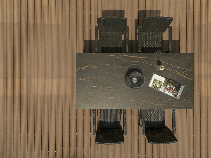


Industrial style interior design uses the materials and visible construction associated with workshops and converted factories: brick, concrete, timber, metal frames and straightforward lighting. To bring that look into an ordinary home, I’d start with the largest surface already in the room, then choose the finishes that sit next to it. An oak floor, for example, gives me a reason to use a quiet grey wall and a few dark metal lines without covering the room in brick.
My aim would be a room where the material choices are easy to read: somewhere for the eye to settle, enough contrast to define the furniture, and light where people actually sit or work. The following examples show which parts I’d keep, change or leave out.
What Makes an Interior Look Industrial?
I wouldn’t make every surface look industrial. I’d choose one dominant texture, such as a brick wall or a concrete-look surface, then use the other materials to support it. These are the features I’d look for:
- Materials: brick, concrete or concrete-look finishes, visible wood grain, and black or brushed metal.
- Colours: warm grey, charcoal, brown and off-white provide a starting palette; a coloured chair or cabinet can change the emphasis.
- Furniture: simple forms, visible frames and useful storage, with enough closed space to keep everyday clutter out of view.
- Lighting: pendants over tables or counters, plus shaded directional lamps where people read or prepare food.
The Industrial Features I Would Keep in View
A brick wall with uneven colour already gives a room a strong texture. A concrete column makes a different contribution: its size and position can organise the space around it. A slim metal window frame adds a line rather than a broad area of colour. I start by identifying which of those features the room already has before adding another conspicuous finish.
In a converted building with brick, beams and a timber floor, my first choice would be quieter furniture surfaces. A heavily distressed table beside a mottled floor and rough wall gives three different textures equal attention. A plain tabletop lets the existing wall remain visible as the main feature.
In a newer apartment, my starting point would be smaller. A concrete-look wall behind a low cabinet, a metal-framed lamp and a wood table can establish the material combination without changing the ceiling. A sound painted ceiling can stay intact unless the renovation has a separate reason to open it. Exposing services or removing a lining belongs with the building team, not with a shopping list for an industrial look.

How I Would Combine Concrete, Wood, Brick and Metal
For an initial scheme, I give each material a place: the broad background, the furniture people touch, or the narrow frame around an object. This makes the choice more specific than collecting several grey and brown samples that happen to look attractive together.
A grey background beside a visible wood surface
Suppose the room has an oak floor and a wall that needs refinishing. My shortlist would include a fine-textured warm grey and a more strongly mottled grey, keeping the floor sample beside both. If the oak has pronounced grain and knots, I’d lean toward the quieter grey. It leaves the floor pattern readable instead of putting another moving texture directly above it.
That preference would change if the room had plain painted cabinetry, a uniform floor and very little texture. A more varied concrete appearance could then do useful work on one wall. A full-face image would be my next check alongside the sample: a small corner may omit the darker patches that will dominate the finished panel.

Metal as an outline or a large surface
A narrow black table frame and a full-height black cupboard do not have the same visual weight. The frame leaves gaps through which I can see the floor and wall. The cupboard replaces that view with a dark block. If a room already has black window frames, I’d repeat that finish in a lamp or chair legs before adding a large black storage unit.
Brushed metal gives another option when black feels too heavy. The doorway and sofa position are the two views I’d compare. A bright metal face opposite a window may draw more attention than the same finish tucked beneath a tabletop. Its position matters as much as the finish name.
Let brick colour affect the next choice
With red or orange brick, I’d place the actual wood finish beside it before choosing cabinetry. An orange-toned wood can make the combined surface area much warmer than either sample suggests alone. A quieter brown, a pale neutral cabinet or a grey worktop gives me a different balance. My preference is to keep the brick visible on one main plane and compare those options there.
Where Sintered Stone Fits Into Industrial Interiors
The concrete appearance is a visual choice; the material behind it is a separate decision. An existing concrete wall, a plaster finish and a concrete-look slab can all contribute grey mineral texture, but their surfaces, edges and installation methods differ.
I’d consider concrete-look sintered stone when the design calls for a fabricated countertop, wall panel or commercial counter surface. It supplies the concrete-style appearance in a manufactured slab format, with a pattern, thickness and edge treatment that can be reviewed before fabrication. It does not replace the room’s brick, timber or metal, and it does not make a panelled wall seamless.
For an oak kitchen, I’d compare a quieter warm grey against the cabinet front. Beside a strong brick wall, I’d look at a low-contrast counter surface. Funtek’s cement-look sintered stone collection is the next place to compare those visual directions. I’d then confirm the chosen finish on a physical sample and review its full-slab pattern, available format, support and fabrication requirements for the intended use.
The Colour and Lighting Checks I Would Make
“Grey” is too broad a description to approve a room. I start the colour comparison by putting the surface sample beside the existing floor, a white card and the proposed cabinet finish. That combination makes a blue, green or brown cast easier to notice. Then I’d stand the wall sample upright in the room; a sample lying on a desk receives light differently from a wall.
A warmer combination for a shaded room
For a room with limited daylight, my starting combination would be a pale greige wall, visible oak or walnut furniture, off-white upholstery and dark metal kept to smaller outlines. I’d keep the ceiling light and look for a wall surface with gentle variation. The wood occupies enough of the view to be noticed; a small wooden ornament cannot do the same work as a cabinet front or dining table.

A cooler combination in a brighter space
In a bright room with large windows, I’d also consider a cooler grey beside darker wood and brushed metal. Some plain, light wall would stay visible so the grey surface has an edge and the furniture does not merge into it. The decision would come from those adjacent materials and the available light, not from a rule that industrial rooms must be dark.

My next check is the shortlist with the actual evening lamps switched on. If a grey surface turns noticeably green beside the cabinetry, I’d reconsider the sample or the lamp before ordering a room-sized quantity. A phone photograph is useful for recording the arrangement, but I’d make the colour decision while looking at the materials in person.
Industrial Style Ideas by Room
Industrial Style Kitchen: Connect the Worktop to the Cabinet Fronts
In a kitchen with timber lower cabinets, a calm concrete-look worktop can continue the industrial direction without adding another wood grain. I want to see the worktop and backsplash together from the entrance. If both have strong mottling, that pattern repeats across a horizontal and a vertical plane, making it more prominent than a flat sample board suggests.
For a small kitchen, I’d try the same quiet surface on the worktop and a simple backsplash, with a limited amount of metal shelving. Closed storage would still have a place. Putting every plate, appliance and spice jar on open shelves changes the finished view far more than changing one handle.

After choosing the appearance, I’d identify the actual surface material. Poured concrete and a concrete-look slab need different fabrication and care decisions. Our concrete-look countertop options provide a next step for readers considering sintered stone. The sink cutout, exposed edge and any joint still need to be shown on the fabrication drawing.
Industrial Style Bathroom: Concentrate Texture Around One Feature
For a compact bathroom, I’d start with a grey wall behind the vanity, a wood cabinet and a dark mirror frame. Repeating the frame finish on a fitting can be enough to connect the parts. I’d keep the adjacent surface quieter so the basin, mirror and storage remain easy to distinguish.

Inside a shower, I’d select the visible finish together with the specified waterproofing and installation system. Schluter's shower waterproofing system illustrates the separate membranes and connection details that sit behind a tiled finish. A rough brick appearance is a design choice; the installer still needs a complete approved wet-area assembly. The required cleaning method is something I’d discuss before choosing a deeply textured surface beside the basin or shower.
Industrial Style Living Room: Keep the Existing Floor If It Works
Take an ordinary living room with an oak floor, white ceiling and one large window. My first option would be a grey feature wall, a low wood cabinet and a metal-legged coffee table. The floor already supplies a large warm area, so there is no need to add distressed wood to every piece of furniture.
If the room still feels hard, I’d change the surfaces closest to sitting: a fabric sofa, a rug under the front of the seating group, and a shaded reading lamp. That is a more specific response than adding another grey finish. In a rental, I’d begin with those movable pieces and leave the fixed wall and floor alone unless alterations are permitted.

Industrial Style Café or Reception: Check the View from the Entrance
For a café, the first view may contain a counter face, shelves, menu, pendant lights and a brick wall all at once. I’d decide which surface should carry the main texture. If the brick is already prominent, a quiet grey counter face and a wood top give the menu and service area room to stand out.
I’d check that arrangement again from a seated position. A pendant that looks well placed in an empty room may sit directly between a customer and the menu. The actual shade size, counter position and sight line need to be considered together. Material approval would also include the cleaning and wear expected at the counter edge, not just the distant room photograph.

The Joints, Edges and Lamps I Would Resolve Before Ordering
A wall made from large panels still has edges, corners and joints. My next step is to draw them over an elevation that includes the door, low cabinet and visible fittings. A joint just beside a cabinet edge creates two close vertical lines; moving the proposed division may make the arrangement easier to read. The installer must retain the joint positions and widths required by the selected system, so I’d resolve the visual layout with those requirements present.

I also want to see a finished edge beside the surface face. A printed concrete appearance does not tell me what a cut edge will look like, and a thick-looking counter may use a built-up edge. The visible thickness, corner treatment and adjoining wood or metal should be agreed as one detail. For a multi-panel wall, the concrete-look wall-panel planning guide goes further into openings, joints and fixture coordination.
For lighting, I’d sit where the lamp will be used and check whether the bulb is directly visible. An open shade can look restrained in a product photograph while placing a bright point in the seated view. I’d choose the shade and light direction together, then check that the preparation surface or reading area receives light without my body blocking it.

When the scheme feels crowded, my first change would be to remove one repeated effect before introducing anything new. If there is rough brick, a distressed table and a heavily mottled panel in the same view, I’d compare the room with one of those surfaces made quieter. That comparison reveals which texture is helping the room and which is competing for attention.
What I Would Put Beside the Surface Sample
To review a concrete-look surface, I’d bring the cabinet or wood finish, the metal finish and a photograph of the whole wall. I’d let the proposed large surface occupy most of the mock-up and represent narrow metal frames with narrow strips. Equal-sized samples can make a small black handle look as influential as a wall that will occupy half the view.
Then I’d check the selected sample upright, the full slab pattern, the proposed joint layout and the visible edge. If the surface still works with those details present, it belongs on the shortlist. I’d keep the selected sample with the cabinet and metal finishes until the final combination is agreed.
For a wall enquiry, I’d send the width and height, openings, preferred finish, approximate quantity and project location. Funtek's interior wall slab supply process can help confirm available options, sample requirements and the agreed cutting and packing scope. The local project team remains responsible for the wall preparation, fixing system and final installation details.
My budget comparison would separate the work into parts: materials, fabrication, delivery, wall preparation and installation. Keeping usable furniture or a sound floor may free budget for the one surface that changes the room most. A slab-only price will not show that full decision, and neither will a shopping list of lamps and chairs.
Compare Surfaces for Your Industrial Interior
Share a room photo, your wood or cabinet finish, and the wall or countertop dimensions. Discuss cement-look samples and the material supply scope with Funtek.