


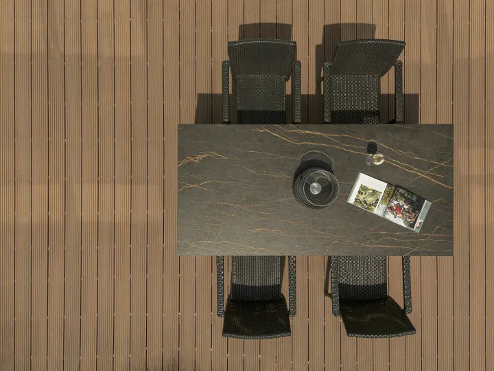


Les couleurs de la pierre frittée sont souvent présentées sous forme d’une rangée de petits échantillons: blanc, beige, gris, noir, vert ou brun. C’est utile pour commencer une liste restreinte, mais ce n’est pas suffisant pour approuver une tablette. La même couleur peut sembler plus chaude ou plus froide sous une lumière différente, paraître calme ou chargée à l’échelle de la plaque, et paraître à nouveau différente lorsque la finition, le bord coupé et les matériaux environnants entrent dans le projet.
Comment choisir une couleur de pierre frittée?
Choisissez la couleur parmi les matériaux déjà fixés — carreteries, sols, finition murale, métallurgie et éclairage — puis évaluez la dalle exacte à l’échelle réelle. Vérifiez son sous-ton, le mouvement du motif, la finition, la couleur du corps et l’aspect des bords exposés avant d’approuver l’échantillon ou le lot.
Pour la plupart des projets, une séquence fiable est la suivante:
- Décidez si la surface doit se fondre dans la pièce ou devenir son point central.
- Associez la note chaude, froide ou neutre de la dalle aux matériaux fixes.
- Vérifiez le motif à l’échelle complète plutôt que de ne juger qu’un petit échantillon.
- Examinez la finition à la lumière du projet réel.
- Vérifiez le corps et le bord de coupe lorsque l’application les expose.
- Approuvez par écrit le produit exact, la finition, la taille, l’épaisseur et la référence de l’échantillon.
La couleur, le motif et la finition sont trois choix différents
Couleur décrit la famille principale des images: blanc, crème, beige, gris, noir, brun, vert, bleu ou une autre tonalité. Motif décrit le mouvement sur ce fond, comme le veinage de marbre, les lignes de travertin, la variation du béton, le grain du bois, les copeaux de terrazzo ou une surface presque solide. Fin décrit comment la lumière interagit avec la surface, y compris des traitements polis, mats, texturés ou autres produits spécifiques.
Une dalle blanche peut être solide, trouble, fortement veinée ou assortie à livres. Une dalle beige peut ressembler à du calcaire, du travertin, du marbre chaud ou à une surface architecturale simple. Une dalle noire peut être plate et graphique ou comporter un mouvement spectaculaire blanc ou or. Appeler chacune uniquement « blanche », « beige » ou « noire » omet la partie qui pourrait dominer la pièce finie.
Utilisez notre Types de motifs en pierre frittée Guide: la question principale est de savoir quelle famille visuelle la surface doit imiter. Poursuivez ce guide lorsque la question principale est de savoir comment la couleur doit fonctionner avec la palette du projet.
Quelles familles de couleurs de pierres frittées pouvez-vous choisir?
Il n’existe pas de catalogue couleur universel partagé par tous les fabricants. Les noms de produits varient également, donc le point de départ utile est un ensemble de familles de couleurs pratiques plutôt qu’une liste de noms marketing.
Blanc et Blanc Cassé
Les surfaces blanches peuvent aller du blanc froid net au blanc crème, ivoire et blanc nuage. Ils sont utiles lorsqu’un projet a besoin d’un fond lumineux et sobre, ou lorsque les meubles et les œuvres d’art doivent avoir plus de poids visuel.
N’approuvez pas « blanc » comme une seule spécification. Vérifiez si la dalle penche vers le bleu-gris, le jaune-crème, le rose, le vert ou le neutre à côté des échantillons du meuble et du mur. Vérifiez aussi combien de mouvement contient la dalle entière. Notre Pierre frittée blanche Le guide traite de cette famille plus en détail.
Beige, Greige et Neutres chauds
Le beige, le sable, le champignon, le taupe et le greige peuvent relier le bois, les métaux chauds et les intérieurs à l’aspect pierre sans le contraste marqué d’une surface blanche éclatante. Leurs sous-tons comptent: un beige peut être jaune et crème, un autre rose ou pêche, et un autre assez gris pour être plus proche du greige.
Ces couleurs fonctionnent mieux lorsqu’elles sont comparées directement avec les finitions en bois fixe, peinture et sol. Le Pierre frittée beige Le guide montre comment le sous-accent modifie la décision de couple.

Tons gris et béton
Le gris peut être froid et à base bleue, chaud et taupe, ou presque neutre. Les gris à l’apparence bétonne introduisent souvent des mouvements troubles ou une texture fine, tandis que les gris à l’aspect pierre peuvent contenir des veines, des fossiles ou des variations minérales.
Voir sur YouTube
Le gris n’est pas automatiquement le neutre sûr. Une surface grise froide peut entrer en conflit avec le chêne chaud, la peinture crème ou le laiton, tandis qu’un gris plus chaud peut s’y associer. Comparez tous les matériaux ensemble plutôt que de sélectionner du gris à partir d’un écran.

Noir et autres couleurs foncées
Le noir, le charbon et le marron profond peuvent ancrer une grande pièce, encadrer des meubles lumineux ou créer un plan de travail d’accueil solide, un îlot ou un mur de façade. La finition modifie considérablement le résultat: une surface sombre réfléchissante, un noir mat discret et un charbon fortement texturé ne se comportent pas comme le même élément de design.
Les échantillons sombres doivent être examinés pour détecter les empreintes digitales, la poussière, les résidus minéraux, les reflets et l’aspect de nettoyage sous la lumière prévue. Les performances et la visibilité varient selon le produit exact et la finition, donc testez l’échantillon fourni plutôt que d’appliquer une règle générale à chaque dalle sombre.

Brun, rouille et couleurs de la terre
Des directions brunes, argiles, rouillées et en terre cuite peuvent relier une surface au bois, à la brique, au cuir et aux finitions architecturales chaudes. Ils peuvent être presque solides, semblables à des pierres ou fortement veinés. Leur succès dépend généralement du contrôle du nombre de sous-tons chauds concurrents dans la pièce.
Si le sol, les meubles et la dalle sont tous chauds, placez-les côte à côte. Une palette coordonnée répète normalement ou contraste délibérément les sous-tons; Trois beiges et bruns sans lien peuvent sembler accidentels.
Vert, Bleu et couleurs statement
Le vert, le bleu, le bordeaux et d’autres couleurs marquantes peuvent transformer une dalle en centre visuel d’un hall, d’un îlot, d’un bar, d’une salle de bain ou d’un meuble. Ils ont besoin de plus qu’un petit échantillon car la quantité de couleur, la direction des veines et la répétition du motif déterminent si le résultat est contrôlé ou écrasant.
Pour une dalle d’épingle, décidez quels matériaux environnants deviendront plus silencieux. Il est généralement plus facile de laisser une surface passer que de faire concurrencer la dalle, les meubles, le sol et le mur.


Commencez par Undertone, pas par le nom du produit
Les noms de produits ne sont pas une norme de couleur fiable. « Ivoire », « sable », « nuage », « argent » ou « gris pierre » peuvent décrire des sous-tons très différents selon les fournisseurs. Commencez par ce que fait la dalle en plus des matériaux fixes du projet.
Placez l’échantillon candidat à côté de la porte de l’armoire, du sol, du crédence, de la peinture, du placage bois et de la finition métallique. Examinez le groupe verticalement comme horizontalement, car la lumière atteint un mur, un plan de travail et un sol différemment. Si le projet utilise de grandes fenêtres, vérifiez la palette à plusieurs moments de la journée.
Utilisez trois questions:
- La dalle répète-t-elle une nuance déjà présente dans la pièce?
- Est-ce que tout contraste est assez délibéré et fort pour paraître intentionnel?
- Quel matériau devrait être l’élément visuel dominant?
Une quasi-correspondance peut être plus difficile à coordonner qu’un contraste délibéré. Deux blancs avec des sous-tons visiblement différents, par exemple, peuvent ressembler à une erreur d’approbation, tandis qu’un contraste clair contre sombre semble être un choix planifié.
Laissez la candidature réduire la liste de couleurs
La même dalle peut jouer un rôle différent sur un plan de travail, un mur, une façade ou un panneau de meuble. Choisissez la demande avant l’approbation finale de la couleur.
Plans de travail, plans de travail et îlots de cuisine
Les plans de travail sont visibles à l’horizontale, sous l’éclairage de la tâche et à courte portée. Ils incluent également des découpes, des bords, des joints et parfois des retours en cascade. Examinez les miettes alimentaires, les marques d’eau, les reflets et l’apparence du nettoyage quotidien sur la finition exacte. Pour une île, étudiez la carte complète de la dalle afin que les veines majeures ne percutent pas les découpes ou ne disparaissent pas dans une jointure.
Si le choix de couleur est pour un projet de cuisine, utilisez le Plans de travail en pierre frittée page pour continuer de la sélection de la palette à la taille de la plaque, à l’arête, au support et à la planification de fabrication.
Murs et plans vasque de salle de bain
Un mur de salle de bain peut exposer beaucoup plus de dalles qu’un petit plateau de meuble. Vérifiez comment la couleur se comporte sous l’éclairage général et en miroir, si les carreaux adjacents sont chauds ou froids, et comment les joints des panneaux influencent le motif. Dans une petite pièce, des veines de pleine hauteur ou une surface très sombre peuvent avoir un poids visuel plus important que ce que l’échantillon suggère.
Pour une planification de zones humides au-delà de la couleur, continuez jusqu’à la Murs de salle de bain en pierre frittée Page de projet.
Murs intérieurs et caractéristiques commerciales
Les murs d’aménagement, les plans de travail d’accueil et les halls d’entrée sont souvent observés de loin. L’échelle du motif et le séquençage des cases peuvent compter plus qu’une différence subtile de nuance visible seulement à portée de bras. Examinez une élévation ou une dalle avant d’approuver un design fortement directionnel.
Meubles et tables
Le mobilier place le bord de surface près de l’utilisateur. Un toit discret peut convenir à des menuiseries détaillées; Une dalle de remarque peut être la caractéristique principale du meuble. Confirmez que la couleur du corps et le traitement des bords proposés soutiennent l’aspect souhaité, en particulier sur les hauts fins, les côtés exposés et les formes arrondies.
Projets extérieurs et de façade
La lumière extérieure peut faire lire une couleur différemment d’un showroom intérieur. Examinez l’échantillon à l’extérieur et en contraste avec les matériaux de la façade. Vérifiez que le produit exact, la finition, l’épaisseur et le système de fixation sont approuvés pour l’usage extérieur prévu; Ne supposez pas que chaque dalle vendue sous le terme général « pierre frittée » ait les mêmes limites d’application.
Comment associer la pierre frittée aux meubles et autres matériaux?
Commencez par la plus grande surface fixe, puis choisissez si la dalle doit se fondre ou contraster. Les associations suivantes sont des instructions de départ, pas des prescriptions universelles.
| Matériau fixe | Direction des couleurs à tester | Que vérifier avant l’approbation |
|---|---|---|
| Chêne chaud ou noyer | Crème, beige chaud, greige, blanc chaud, verts choisis ou un contraste sombre délibéré | Sous-tons jaunes, rouges ou roses; chaleur veineuse; Finition métallique |
| Meubles blancs | Blanc chaud pour un mélange doux, gris ou noir pour le contraste, ou une dalle colorée qui marque | Si les deux blancs s’affrontent; la lumière de la pièce; Transition de crédence |
| Meubles gris | Greige chaud, blanc, fusain ou une couleur contrastante contrôlée | Que le gris de l’armoire soit bleu, vert, violet ou chaud |
| Des meubles noirs ou très foncés | Neutre en lumière pour le contraste ou une dalle sombre pour un schéma monolithique | Lumière naturelle, reflets, empreintes digitales et perte de définition des contours |
| meubles crème ou beige | Un neutre chaud coordonné, un aspect pierre douce ou une surface sombre clairement contrastante | Évitez les quasi-matchs accidentels avec des sous-entendus différents |
| Meubles colorés | Neutre discret ou une dalle qui répète délibérément une tonalité de cabinet | Décidez quelle surface mène; Éviter la concurrence égale |
Les détails métalliques modifient aussi la palette. Le laiton, le bronze et le cuivre renforcent la chaleur; le chrome et certaines finitions en acier inoxydable peuvent affûter un schéma de refroidissement; Le matériel noir peut soit encadrer une palette de lumières, soit disparaître dans une palette sombre. Compare toujours les échantillons réels car les revêtements et l’éclairage modifient ces effets.
La finition, la couleur de la carrosserie et les détails des bords peuvent modifier le résultat
Une surface polie peut augmenter les réflexions et la profondeur visuelle. Une finition mate ou texturée peut adoucir la réflexion et rendre la couleur nominale plus calme ou plus minérale. La finition modifie aussi l’apparence des marques et des résidus de nettoyage, donc examinez le produit exact plutôt que de choisir la finition dans une description générique.
Pour les plans de travail, les tables, les escaliers et autres applications à bord apparent, la surface supérieure n’est qu’une partie du choix des couleurs. Vérifiez si la dalle est sur le corps entier, assortie ou imprimée en surface, et examinez un bord coupé ou une coupe transversale. Un corps coordonné ne répète pas nécessairement chaque veine de surface.
Le détail pierre inter-corps versus pierre frittée imprimée en surface Le guide explique comment inspecter le corps de la dalle et le bord exposé. La terminologie et la disponibilité des finitions sont spécifiques au produit; Consultez les options actuelles via Funtek Technologies de surface en pierre frittée page et le dossier technique exact fourni pour la dalle.
Approuvez la planche complète, échantillonnez et lotez — pas seulement une image d’écran
Les images en ligne sont utiles pour la découverte, mais les réglages d’écran, la photographie, la compression et la lumière ambiante peuvent modifier la couleur visible. Un petit échantillon confirme de manière plus fiable la surface et la tonalité, mais il peut ne pas montrer l’échelle complète du motif, la répétition, la direction ou la variation de la veine sur une plaque.
Utilisez un processus d’approbation par étapes:
- Liste numérique: Comparez les directions générales des couleurs et des motifs.
- Examen complet: Inspectez la conception complète, le déplacement et la disposition utilisable.
- Échantillon physique: Comparez les sous-tons et les finitions avec les matériaux fixes du projet.
- Avis sur Edge: Inspectez la couleur de la carrosserie, le bord coupé et les détails du bord souhaités.
- Maquette d’application: Placez l’échantillon dans la lumière du projet et l’orientation.
- Confirmation du produit: Note le code produit, la finition, la taille et l’épaisseur.
- Approbation par lot: Confirmez la référence de production ou d’expédition lorsque la continuité de l’ombre est importante.
Pour un projet multi-slats, il faut s’accorder sur ce que l’échantillon approuve. Approuve-t-il uniquement la famille générale des couleurs, ou aussi le mouvement du motif, le niveau de brillance, la couleur du corps et la variation acceptable? Inscrire cette limite dans le dossier d’achat est plus utile que de se fier uniquement à un nom de couleur.
Que doit contenir un dossier couleur pierre frittée?
Un cahier des charges clair aide un fournisseur à retourner les dalles pertinentes au lieu d’envoyer un catalogue sans restriction. Incluent:
- emplacement d’application et d’installation;
- projeter une utilisation campagnarde et intérieure ou extérieure;
- famille de couleurs et sous-tons préférés;
- le motif préféré, le caractère et le niveau de déplacement;
- préférence de finition;
- des images ou exemples d’meubles, de sol, murs et métal;
- la taille, l’épaisseur et la quantité requises si elles étaient déjà connues;
- qu’il s’agisse de bords exposés, de découpes d’évier ou de retours en cascade sont prévus;
- demande des images en pleine table, des échantillons et des photos de bord;
- une couleur ou une variation de lots acceptable;
- Planning et destination cibles.
Ne vous inquiétez pas si chaque spécification n’est pas fixée lors de la première consultation. Le but du mémoire est de mettre en lumière les décisions qui nécessitent encore une approbation.
Le résultat final
Les couleurs de pierre frittée doivent être choisies comme faisant partie d’un système de surface complet, et non comme des échantillons isolés. Choisissez d’abord le rôle visuel, puis confirmez la tonalité, l’échelle du motif, la finition, l’application, la couleur du corps et les bords. Terminez par une revue complète et un échantillon physique sous la lampe du projet.
Ce processus transforme « nous voulons un beige chaud » ou « nous aimons cette dalle noire » en une sélection que le designer, l’acheteur, le fabricant et le fournisseur peuvent tous comprendre et vérifier.
Sélectionnez les bonnes couleurs pour votre projet
Envoyez-nous votre candidature, vos références d’armoire et de sol, votre sous-tonalité préférée, votre taille et votre finition. Funtek peut aider à réduire les options en dalle et à organiser des images ou échantillons complets pour approbation.